FRIDAY FUN DAY CHALLENGE
Where imitation is the highest form of flattery!
Hi everyone! Natalie here again...
It's Friday, and you know what that means-- Lucky Girls Friday Fun Day!
Aren't the colors in the March kit rich and sumptuous? They inspired me to make a layout using photos I had just taken (believe me, I have never scrapbooked anything this quickly after the fact!). I took these photos on a Thursday night and started working on my project the next evening!

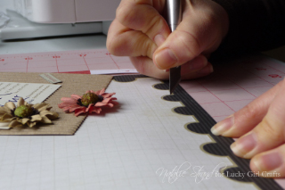
First, let's talk about the way I used the paper from the March kit. I loved the Stamp of Approval patterned paper, but I felt like my photos looked funny on the otherwise wonderful creamy grid. By chance, the paper got flipped over while I was working, and I saw my photos with that wonderful red tone-on-tone B-side. The color accentuated the dim,warm light in the photos from the restaurant, but I still loved that border, so I decided to take a risk and cut out the center of the paper and flip it so that the red was framed by the black stamp edge...

I think it came out pretty well!
I also want to talk about the collage photo.
I had a lot of photos from our date night at a French restaurant. It was our first time eating "real" French cuisine, and I was excited about all the wonderful dishes we had. When I started making my layout, I decided the best way to include all my photos was to make a collage.
Now, you can have collage photos printed through a lot of online photo printing places, and their software makes arranging the photos really easy. But I wanted a little more control (and the instant gratification of having the print in my hands within minutes of finishing it, haha)!
Want to make your own collage layout, too? I used Photoshop Elements for mine, and here's a quickie tutorial...I'm not an expert, but these 6 steps worked for me:
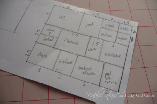
1. I sketched my collage layout on a piece of scrap paper (yes, nerd that I am, it is to scale! 1 cm = 1") to plan where each photo would go.

2. I opened all my photos in Photoshop Elements Editor (I made sure to adjust the color, etc. on each one individually).
3. I created a new canvas of the size I wanted (in this case, 8"x10"), specifying a resolution of 300 pixels/inch.
4. I cropped each photo to the size I wanted (using my diagram), again specifying a resolution of 300 pixels/inch.
5. I dragged and dropped into position each cropped photo onto the large canvas, and used Edit>Stroke (Outline) Selection... for each photo layer to create a black border.
6. I saved the finished canvas as a .jpg and printed it with my photo printer!
I think the longest part of the whole process was deciding how to arrange my photos!
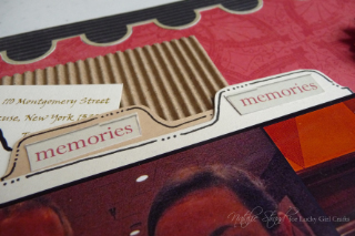
I added some journaling (including our selections from the menu!) on cards tucked into a pocket behind the photo...

...and embellished with those fabulous Prima Damsels, a strip from the Borders patterned paper, and a few bits of Ephemera.

I hope this project inspires you to use your Lucky Girl kit in a new way! I can't wait to see what you create. Be sure to link up your projects to this post for your chance to win!
Lucky Girl Supplies:
patterned paper: Echo Park "For the Record" (Stamp of Approval, Borders)
embellishments: Prima Damsels, K & Co. ephemera, corrugated cardboard
other supplies:
scrap cardstock for journaling pull-outs
foam adhesive
black pen
Thanks for playing along with the March Friday Fun Day Challenge! Link your projects here:


I love how you cute our the paper to flip it!!! Yikes for me, as I don't do very well with a craft knife! Wonderful layout and great use of the multi pictures!!
ReplyDeleteThat is one awesome layout! Thank you for sharing!
ReplyDeleteLove those flowers! I thought I'd make a card with mine!
ReplyDelete